Server Extension Programmer's Guide:
Using Custom User Interfaces
What Are Custom User Interfaces?
Custom User Interfaces allow you to replace eRoom default Frame.asp, which controls the layout of eRoom pages, dialogs, and popup dialogs. Custom User Interfaces also allows you to replace eRoom's cascading style sheets.
In addition to the various ways your eRoom users can customize their eRooms, eRoom 7 allows you to change much of the appearance of eRoom's appearance on your server by configuring a custom UI. You can change fonts and colors, add and remove buttons, rearrange the existing controls and otherwise fine-tune the page structure to suit your organization's needs.
There are three important caveats about these customizations:
We assume you're familiar with ASP, HTML, and CSS already. In particular, getting Web pages to look the same in Netscape 4, Mozilla, and Internet Explorer is an arcane art, so be sure you know what you're getting into.
An eRoom site can accommodate one UI at a time, so your changes will apply to all eRooms on all servers at your site. You cannot customize the UI of one eRoom one way and one another. The only pages that are not affected by customization are the online help pages.
Because the files you change control the appearance of every page in eRoom, you'll probably want to work on them either when nobody is using your site, or experiment with them on a second eRoom site and then configure them on your working site when you're sure they're working correctly.
Keep in mind that you can add conditional changes to custom UI Frame.asp file itself, using the IERUCustomContext returned by ERGetCustomContext() function. Using the custom context object, your frame could conditionally add or control content based on the EventID, LoggedinMember, Community, Room, or even Item (anything really). Note that IERUCustomContext::EventID returns the event id of the page that is being generated when called from within a custom UI ASP file.
Preparing for UI Customization
eRoom 7 ships with a sample extension called Custom UI Sample, which you can configure at your site. You can find a copy of this extension's primary folder in the Toolkit\Samples directory (usually c:\Program Files\eRoom\eRoom Server\Toolkit\Samples\CustomUI\Custom UI Sample).
To use this extension at your site, copy its primary folder ("Custom UI Sample") into the ~Extensions folder on your site's primary file server. Configure the extension using the Extension Manager on any eRoom server at your site. Then, server by server, update each eRoom server at your site by running the Extension Manager and using the Update Local Server tab. Finally, turn on the extension using either the Extension Manager's Configure dialog or the Extensions page in Site Settings. Now go into an eRoom and see how this extension has changed the appearance, yet the content of the eRoom remains exactly the same.
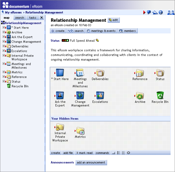
Before the change, your eRoom page looked something like this.
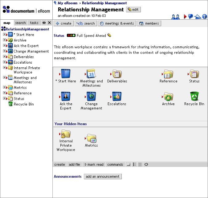
Now it looks more like this.
Custom_frame.asp
To create the sample customization, we modified both the structure of the page, and the styles. Let's look at the HTML changes first. Open the page frame files for eRoom's standard UI (Frame.asp) and the custom UI sample (Custom_frame.asp) in your text editor. The former file is located in the eRoomASP directory on an eRoom server (usually c:\Inetpub\eRoom\ThinClient\en), and the latter in the \script subfolder in the primary folder you copied to ~Extensions (i.e. [primary file server]\~Extensions\Custom UI Sample\script). If you have an editor that lets you compare them, that's even better.
Frame files have the following functions:
InsertPageStyles: this inserts the link to the style sheet. In Frame.asp this points to eRoom.css; in Custom_frame.asp it also points to eRoom.css but then redefines some styles by pointing to its own style sheet, Custom_styles.css. Note the "Extensions/eRoomSample.CustomUI/" path used to specify Custom_styles.css: see Performing a Customization of Your Own below for an explanation of how to use this syntax yourself.
Custom banners: You can control the default banner for eRooms and communities that do not specify their own by setting the gDefaultLogo variable to the appropriate graphic filename. The syntax for the file path must be the same as for InsertPageStyles, above. The banner dimensions expected by the page frame must be declared by setting gMaxLogoHeight and gMaxLogoWidth. eRoom uses these settings to decide whether and how to resize a banner.
Custom hovering effect: When a user's pointer hovers over the map's close button or its clickable edge, the background of the map or its adjacent gutter changes from a CSS style to an image. Use gMapBorderGlow to designate that image, with the same kind of path as described for custom style sheets, above.
Thin button coloring: gThinbarStyle and gThinbarOverStyle have required statements that control the default CSS styling of the thin button bars (containing buttons such as "add file" and "mark read") immediately below item boxes. Don't change them. If you want to restyle the buttons, edit the CSS styles: thinbuttonbar and thinbuttonbarover. See Style-sheet elements, below.
GeneratePage: this routine provides the page layout for all eRoom content pages, plus the Search, Members, Settings, and My eRooms pages. See GeneratePage functions, below.
GenerateDialog: this routine handles the layout of all eRoom dialogs that appear in the page (as opposed to in pop-up windows). In theory, the dialog layout could be completely different from the page layout, but in the default frame they have deliberately been kept very similar. See GenerateDialog/GeneratePopUpDialog functions, below.
GeneratePopUpDialog: this routine handles pop-up dialogs, like the comment editor. See GenerateDialog/GeneratePopUpDialog functions, below.
GenerateButton: this function draws all eRoom-style buttons (OK, Cancel, add a comment, take a vote, etc.). It contains whatever HTML you want, and receives several parameters from eRoom indicating the characteristics of the particular button being drawn. See GenerateButton parameters, below.
Notice that none of the changes to Custom_frame.asp had anything to do with colors or fonts. Those attributes are determined in the eRoom.css and Custom_styles.css files. If you open these style sheets in your text editor (or compare them, if possible), you'll see several changes that determine the pages' styles. eRoom.css is located in the eRoomData directory on an eRoom server (usually c:\Inetpub\eRoom\ClientData). Custom_styles.css is located in the \data subfolder in the primary folder you copied to ~Extensions (i.e. [primary file server]\~Extensions\Custom UI Sample\data).
Frame customization functions
Most of the frame file (Custom_frame.asp or your own version) is just HTML to define the page layout. To tell eRoom where to insert the buttons and content, you use the following ASP functions:
GeneratePage functions
InsertPageHeader, gBodyTag, InsertPageBodyParams, InsertPageControls: these are required functions that insert standard page-header and -footer information. There's nothing about them you can change, and the page won't work if you take them out, so just leave them where they are.
GenerateLockMessage: inserts a "server locked" warning when visiting a page on a locked server. You can move this text around, but make sure it appears somewhere on the page.
=gMapWidth: inserts the current map width, in pixels. Useful if you want the map and some other part of the page to have widths that line up.
=framePageLogo: inserts the custom banner for the current page, if there is one, or otherwise the default banner.
=frameContext: inserts the whole path for the current page, with each step in the path as a clickable link.
=framePageName: inserts the name of the page.
InsertEditButton: inserts the edit button for the current page. You can move this button around, but make sure it appears somewhere on the page.
InsertMyeRoomsButton, InsertUpButton, InsertNextUnreadButton, InsertIntercomButton, InsertAlertButton, InsertHelpButton, InsertShowMapButton, InsertHideMapButton: these functions insert the corresponding tool buttons as used in the standard eRoom 7 UI (Frame.asp). This means that My eRooms is rendered as text, Up is rendered as an icon, and the rest are rendered as icons inside HTML table cells with dynamic CSS effects (see Style-sheet elements, below). The ones that are table cells should be enclosed in an HTML table and table row. The intercom icon changes appearance when there is a conversation going on in the Intercom. The buttons for Next Unread, Intercom, Alert, Show Map, and Hide Map automatically vanish when not applicable. Insert...ButtonIcon and Insert...ButtonText inserts the icon-only or text-only versions of these eight buttons, without any HTML table cells or dynamic effects. The icons and text for Next Unread, Intercom, Alert, Show Map, and Hide Map show up (but look disabled) when not applicable.If you want to provide different text or graphics for one of these functions, use InsertFunction, described below.
InsertResizeButton: inserts a button for toggling the map between narrow and wide, rendered inside an HTML table cell with dynamic CSS effects.
=framePageSubTitle: inserts the creation info for the page (i.e., the "a folder created by...on...").
InsertPresence: inserts the row of little people indicating which members are present in the eRoom. If you take this out, you can still see the list of members present by opening the Intercom.
InsertMap: inserts the map. You can use eRoom without the map, but it won't be pleasant, so we recommend that you don't remove it unless you have a really good reason.
gShowMap: indicates whether the map is shown (True) or hidden (False).
gAllowMap: indicates whether the map may be shown on the current page (True) or not (False). For example, gAllowMap is false on all Settings pages.
InsertMapTab("map"), InsertMapTab("search"), InsertMapTab("tasks"): inserts the tabs as usually shown above the map, permitting users to switch between the hierarchical item tree with the +/- buttons, an abbreviated search form with results list, or a list of tasks assigned to you. Each tab is rendered as an HTML table cell with dynamic CSS effects, and should be enclosed in an HTML table and table row. The tab widths are set equal. The chosen tab has a distinct appearance and is not clickable.
InsertHideMapTab: inserts the close-map button shown next to the three tabs in eRoom's usual UI. Like those tabs, this one is rendered as an HTML table cell with dynamic CSS effects and should be enclosed in an HTML table and table row. Hovering over the tab changes not only the tab but also the background of the map.
InsertMapBorder(color 1, image 1, image 2, color 2): inserts the HTML table cells for the clickable, vertical border separating the map from the page, along with the adjacent gutter. Hovering over the border changes not only the border but also the background of the gutter. Four parameters are required: background color, background image, background image during mouseover, background color during mousedown.
GenerateBody: inserts the body of the page, including the page-specific buttons (if any), the page text, and the attachments box and comment area if those are shown. You can't directly modify the internal HTML structure of this block, but you can change many aspects of the display by modifying styles, as detailed below.
GenerateDialog/GeneratePopUpDialog functions
InsertHeadingAndTitle, InsertBodyParams, InsertFormTag: these are required functions that insert standard dialog-header information. Don't change them.
=InsertFramePageLogo: inserts the logo. This is the dialog version of framePageLogo, described above. Not used in GeneratePopUpDialog.
=InsertRoomName: inserts the name of the eRoom. This is the dialog version of frameContext, described above. Not used in GeneratePopUpDialog.
=InsertPageName: inserts the name of the page this dialog refers to, if applicable. Not used in GeneratePopUpDialog.
=InsertDialogTitle: inserts the title of the dialog.
InsertDialogBody: inserts the body of the dialog.
GenerateButtonBarPopup: Inserts an button bar appropriate to either style of dialog.
GenerateButton parameters and helper functions
The parameters you must use for the button to function are:
buttonOnClick: a JavaScript function that must be attached to the button text/graphic and/or a containing element.
startLink: the start of the <a> tag that must surround the button text/graphic.
endLink: the end of the <a> tag.
If the button is a rectangle, and you want clicks anywhere on the button (not just on the title) to function, you must also use:
ULName: a name attribute that must be attached to the Upper Left corner of the button's rectangle.
LRName: a name attribute that must be attached to the Lower Right corner of the button's rectangle.
The rest of the parameters are technically optional, but unless you have something radical in mind you'll probably want to use them all:
buttonWidth: the target width of the button. If no width is specified, buttons are as narrow as their title permits.
buttonDisabled: a string controlling the desired enabled/disabled state of the button. For example, buttons like "add a comment" are disabled if your role in an eRoom is observer.
startBold: a variable to be inserted before the button title, if eRoom's default bolding of certain button titles is desired.
buttonLabel: the button title.
endBold: the end of bolding.
The version of GenerateButton in eRoom's standard UI (Frame.asp) uses two helper functions:
gIsInBar: indicates whether button is appearing inside a button bar (True) or not (False). For example, on the front page of an eRoom the "members" button is in a bar while the "add an announcement" button is not.
gIsFirstButton: indicates whether a button is the first, left-most button in a button bar (True) or not (False). For example, in most dialogs the "OK" button is the first in the bar while the "Cancel" button is not.
eMouseOver(object, style) and eMouseOut(object, style): JavaScript functions that can dynamically change a button's CSS styling. They take two parameters: a DOM object and a CSS style. The functions are made available for scripting via InsertPageHeader.
Note: Instead of building your own button routine entirely from scratch, Documentum highly recommends that you start by copying this function from Frame.asp and modifying it in your custom frame file. Better yet, start your customization by copying the whole Frame.asp file first.
Utility functions
=Spacer(height, width): inserts a transparent .gif file of the specified size. Useful for controlling table spacing.
=gGraphicURL: inserts the path to the eRoom data/graphics directory, including the trailing "/".
=eImageAlt(filename, alt-text, alignment): inserts a standard-format IMG tag for a graphic in the eRoom graphics directory. For example:
=eImageAlt("tbHelp.gif","help","left")
inserts the icon for the "help" button, with "help" alt text, left-aligned.
InsertFunction (function, tableCell, enabledHTML, disabledHTML, specialHTML): this function gives you a way to insert a custom button attached to one of eRoom's built-in functions. The parameters are:
function: "myerooms", "upalevel", "nextunread", "find", "intercom", "alert", "help", "mapon", "mapoff", "mapofftab". "mapon" and "mapoff" produce buttons equivalent to their Insert...ButtonIcon or Insert...ButtonText counterparts, described above. "mapofftab" produces a button identical to "mapoff" except that if it is rendered as an HTML table cell, it has the same dynamic CSS effects as InsertHideMapTab.
tableCell: whether the button should be rendered as an HTML table cell with mouse-over CSS effects (1) or as just a piece of HTML (0). If (1), the button should be enclosed in an HTML table and table row.
enabledHTML, disabledHTML: the HTML code for the enabled and disabled cases. If you want the button to disappear in the disabled case, just specify an empty string ("").
specialHTML: this parameter applies only if you're inserting a custom Intercom button, and provides the HTML for the button when there is a conversation going on in the Intercom. For all other buttons, just specify an empty string ("")
One final note about frame changes: in order for the fonts and margins in the style sheet to work correctly, all text must be inside of DIV tags. Text inside table cells must be inside DIVs within the table cells (i.e., "<td><div>text</div></td>"). And be especially careful to close all DIVs, TDs, TRs and TABLEs properly, otherwise Netscape will yield unpredictable results.
Style-sheet elements
The classes in the default style sheet are broken up into groups according to their general function. eRoom's usual style sheet, eRoom.css, includes some @media definitions for printing, which are recognized by user agents such as Internet Explorer and Mozilla that support media types.
Overall formatting
div: the default font and margin settings are applied to the DIV tag, thus the importance of making sure all your text is within a DIV tag.
Line and background colors
.pagebackground: the color for the bottom of the page, below all the content.
.pagebody: the background color for the content area.
.pageborder: the color for the main lines between the different regions on the page.
.pageborder2: the color for the secondary lines between buttons on thin button bars, between columns in the item box, between days in the calendar, etc.
.pageborder3: the color for horizontal divider lines on My eRooms and Search All eRooms.
.bannerbackground: the background color for the region containing the banner graphic.
.toolbar: the background color for the toolbar.
.toolbarover: the background color used to highlight a cell in the toolbar when the pointer moves over it.
.gutter: the background color of various charts and lists, such as in Site Settings.
.dialogbackground: the background color for dialog-box pages.
.buttoncolor: the background color of date pickers and headers in various charts and lists, such as in Site Settings (used to control the button-face color)
Page elements
.eRoomname: the font and color for the current page's path (see frameContext, above), the links for Active eRooms and Administration in My eRooms, and the item name shown above the title in a dialog.
.pagetitle: the size and color of page titles. The "margin-right: 0" part fixes some Mac line-wrapping problems, so don't take it out.
.pagesubtitle: the size and color of the page credits (i.e., "a folder created by...on...").
.columnheading: the background color and font size for column headings in item boxes and member lists. Note that you can't control the text color of column headings with this style, because they're links, whose color is set separately, further down the style sheet.
.itemboxbackground: the background color and background image for the item box.
.itemboxborder: the border around the left and top of item boxes, and the right and bottom of buttons.
.itemboxhilite: the border around the right and bottom of item boxes.
.itemboxshadow: the shading just inside the left and top of item boxes.
.main: the margins for body text.
.section: the size and color for section headings (e.g., "Comments", "Announcements", "Attachments").
.settingssection: the size and color of the section dividers on settings pages.
.smallprint: the size, color and alignment for the copyright notice and legal disclaimer on the login dialogs.
.contextmenu: the appearance of the context (right-click) menus.
.contextmenuitem: the appearance of the choices on the context menus.
Buttons
.buttonborder: obsolete (used to be the button-edge color).
.buttonbackground: the background color and image for dialog buttons and the main action buttons on content pages ("edit" next to item titles, "add a comment" above comment areas, "create" on folders, "start a new topic" on discussions, etc.).
.buttonover: the background color and pointer style for such buttons when the pointer moves over them.
.buttonbar: the color for the bar that contains such buttons.
.buttontext: the font size, margins and alignment for such buttons.
.thinbuttonbar: the default background color and image, and pointer style, for thin button bars (containing buttons such as "add file" and "mark read") immediately below item boxes. Also used for the map tabs. Thin button bars in project plans and databases, and their entries, use database styling (below) instead.
.thinbuttonbarover: the default background color for such button bars when the pointer moves over them.
.disabled, .disabled div: the text color and and pointer style for buttons when they are disabled (e.g. when an observer sees an "add a comment" button).
Map elements
.map: the background color and font size for the map.
.currentitem: the background color for the highlight bar in the map that indicates which item you're currently on.
.mapsearchbox: the font and margins of the map's search box (the area that surrounds the text box, "search" button, "unread" check box, and "more options" button).
Special text states
.unread, .unread .user: the color of unread comments, votes, database entries, etc.
.error: the color of error messages that appear within pages or dialogs.
.comment: the font style of automatic annotations, such as "There are no groups" on a Members page.
Help
.help: the color of the "For more information, see..." notes on dialog pages.
.helpheader: the background color for the "Tips"/"Notes" headings on some dialogs.
.helpheadertext: the color for the text in "Tips"/"Notes" headings.
Links
a: the default color for links. Virtually all interface elements in eRoom are links, so if you change this you'll probably regret it later.
a.droptarget: the color the title of an item changes to when you drag something over it.
a.reverselink: the color for the previous/next month/week links in calendars, which appear on a dark background.
:hover: the color links change to when you hover over them in Internet Explorer or Mozilla.
.user a, .help a: the color and treatment for links within user-editable fields and Help text. These links are blue and underlined, by default, and you should only change them if your organization has adopted some other default.
Intercom
.intercombody: the background and foreground colors for the conversation area in the intercom. Don't change the "margin: 0" part.
.intercomcomment: the background and foreground colors for the bottom section of the intercom, where you type your own comments. Again, don't change the margin.
Calendars
.calendarheadingcolor: the background color for the heading in month and week views and in date pickers.
.calendarmajorheading: the size and color for the current month or week at the top of the month/week view.
.calendarminorheading: the size and color for the other text and links in the calendar heading (previous/next month/week, days of the week, etc) and in date pickers.
.calendardatecell: the background color for the part of the date box where the items appear.
.calendardateheading: the background color for the part of the date box with the date number.
.calendardatenumber: the color of the numbers themselves.
.calendarotherdatecell, .calendarotherdateheading, .calendarotherdatenumber: same as the previous three styles, but for the days at the beginning and end of the month view that aren't part of the current month.
Databases and project plans
There are four sets of these styles, with 0, 1, 2 or 3 in place of "X" below, for the four color schemes users are allowed to select for databases. The dialog for picking color schemes uses the same styles as the databases themselves, so if you change these color schemes the dialog will update right along with the pages. Project plans use scheme 0.
.dbstyleXtable: the color of the lines between cells (databases, not project plans).
.dbstyleXbodycell: the background color of the data cells.
.dbstyleXedgecell: the background color of the column headings and checkbox cells.
.dbstyleXbodytext: the color of the text in data cells.
.dbstyleXedgetext, .dbstyleXedgecell a, .dbstyleXthinbar a: the color of the text in column headings and the thin button bars.
.dbstyleXedgecell a:hover: the color of column headings and buttons in the thin button bars when you hover over them in IE or Mozilla.
.dbstyleXthinbar: the background color and image for thin button bars.
.projecttable: the color of the lines between cells in project plans.
.projectganttsummary: the background color of project plan Gantt bars in summary rows, like the "All tasks" row.
.projectomittedtask: the background color for a project plan row containing a task marked "omit."
My eRooms styles
There are four sets of header styles, with 0, 1, 2 or 3 in place of "X" below, for the four color schemes users are allowed to select for subheadings on the My eRooms page.
.myeroomsheaderX: the background color of the subheading.
.myeroomstextX: the color of the subheading's title.
.myeroomsdivision: the background color of the built-in divisions on the My eRooms page (e.g. "Active eRooms") and other pages like member lists, Member Info, Create Project, Community Settings, and Site Settings.
.myeroomsdivisiontext, .myeroomsdivisiontext a: the color of the title in such a division.
.myeroomsdivisiontext a:hover: the color of such titles when you hover over them in IE or Mozilla.
Usage Reports styles
.usageReportSummary1: the background color of an overall summary row (e.g. "These 2 servers").
.usageReportSummary2: the background color of overall summary rows when a report is divided into weeks (e.g. "01 Jan 12 to 17 Jan 12").
.usageReportGroup1: the background color of a grouping summary row in a Rooms report (e.g. "Rooms on serverABC").
.usageReportGroup2: the background color of grouping summary rows when a Rooms report is divided into weeks.
.usageReportObjectA1: the first of two alternating background colors for data rows.
.usageReportObjectA2: the first color when a report is divided into weeks.
.usageReportObjectB1: the second of two alternating background colors for data rows.
.usageReportObjectB2: the second color when a report is divided into weeks.
Styles you shouldn't change
Do not change the following styles:
div b, .user, .noindent, .itemname, .largeitemicon, .largeitemname, .dialogbuttons, .pollindent1, .pollindent2: these styles have strictly internal functions, and no good will come from using them. Trust us.
Performing a customization of your own
Now that you know how our sample customization works, you're ready to do your own.
At a minimum, a custom UI extension must have a primary folder containing a \script subfolder, which in turn must contain a frame file in ASP format. If your extension has resources like style sheets or images, they must be placed in a \data subfolder. In your frame file, references to these files must have a path of "Extensions/" followed by the unique ID you intend to give your extension, instead of a path like "/data". For instance, if you plan to give your extension an ID of "acmeCorp.coolUI", you would refer to a file named "styles.css" as "Extensions/acmeCorp.coolUI/styles.css".
To get your extension up and running, put its primary folder in the ~Extensions folder on your site's primary file server. Configure it using the Extension Manager on any eRoom server at your site; in the Configure dialog, enter your chosen ID in the ID field and choose your ASP file in the Frame File list box. Then, server by server, update each eRoom server at your site by running the Extension Manager and using the Update Local Server tab. Then turn on your extension using either the Extension Manager's Configure dialog or the Extensions page in Site Settings. (Note that unlike other types of extensions, turning a custom UI on or off takes effect only when it is performed on the local server or when IIS is restarted on the local server, whichever comes first.)
For detailed instructions on deploying server extensions, refer to the Configuring Your Server Extension topic.
To revise your extension, edit the files in the primary folder and run Update Local Server again. Alternatively, you can directly edit the live copies made by the Extension Manager on a given server (in Inetpub\eRoom\ThinClient\extensions\[your ID] and Inetpub\eRoom\ClientData\extensions\[your ID]). But be warned, the Extension Manager will overwrite these the next time you run Update Local Server; the only way to preserve your work for sure is to keep the original files in your primary folder up to date.
To get started:
Prepare a primary folder for your extension, with a "data" and a "script" folder inside it.
Go to the eRoomASP directory and copy Frame.asp. Paste it in your \script folder with whatever name you please.
Go to the eRoomData directory and copy eRoom.css. Paste it in your \data folder with whatever name you please.
Add any new graphics you need to your \data folder.
Edit your frame file and change the style sheet link at the top to point to your style sheet.
Follow the instructions above for configuring your extension and updating your servers.
Change some things. Test. Repeat.
Never edit Frame.asp or eRoom.css directly, or modify a built-in eRoom graphic. Always make your changes in new files. This ensures that you will always be able to restore the default layout by turning off your custom UI.
Upgrading
When you upgrade from eRoom 6 to eRoom 7, the CustomizationSettings.asp file is deleted and a new one is added to the Custom directory. However, if you reinstall the eRoom 7 server, or install a 7.x upgrade, it is not overwritten, and your custom frame, style sheet and graphics are also not affected.
Note that frame files are relatively eRoom-version-specific and likely require rework/rewrite between major releases of eRoom. Your best bet is to copy the default/core Frame.asp (found in eRoomASP/EN) and reapply your previous customizations to the clean page.
Testing
This might sound obvious, but before you let people start working with your customized pages you should make sure everything's working, and looks like you want it to look. Create one of each item type, and make sure you like your layout in all the cases. Check My eRooms, the member pages for eRooms and groups, the Search pages within an eRoom and at My eRooms, and the settings pages for eRooms, communities, and the site. Check a few sample dialogs (create, access control, notification, etc.). Try IE and Netscape, if your organization uses both. Try the Mac and/or Unix, if you use those platforms. Look at your color and font choices on different people's monitors. If you've put in custom tool buttons, make sure they look OK when they're disabled. Show it to a few people before you unleash it on the world. And if something horrible happens, remember that the default layout is only a few keystrokes away &endash; just use the Extension Manager's Configure dialog to turn your custom UI off.
Removing a custom UI
Like all eRoom extensions, a custom UI should be removed only via the Extension Manager. Manually deleting folders and files created by the Extension Manager on an eRoom server will only convince the Extension Manager that the server needs updating again.
Removing an extension via the Extension Manager also deletes that extension's primary folder in your site's ~Extensions folder. If you care about the files there, back them up before removal.
Deprecated in eRoom 7
Functions
InsertTaskButton: use InsertMapTab("tasks") instead.
InsertSwitchMap: use InsertMapTab("map") instead.
InsertSwitchSearch: use InsertMapTab("search") instead.
"align" parameter for GenerateButton: buttons are now always aligned horizontally.
"members" argument for InsertFunction: "members" is no longer a toolbar button.
Styles
.mapheadingtext: tabs at top of map are now built by InsertMapTab and are styled like thin buttons (using thinbuttonbar).
.mapheadingcell: ditto.
.mapborder: eRoom's usual UI no longer has a border wrapping around the map.
.accentcolor: eRoom's usual UI no longer has a horizontal bar for the page credits.
.dialogbuttoncolor: use buttonbar to style the bar that contains dialog buttons and the main actions on content pages ("create" on folders, etc.).
.directoryborder: there is no longer a facility-level Directory of eRooms.
.settingsheading: ditto.
.dbstyleXrule: there is no longer a line outside and around a database.